Content originally published 8/2018
6-minute read
Wondering how to design an analytics dashboard? A dashboard is a living thing that evolves with the needs of its users, as well as the availability and quality of the data used to create it. To ensure your analytics dashboard can provide actionable business intelligence and never becomes irrelevant, we have developed the Enterprise Dashboard Design Process.
What is the Enterprise Analytics Dashboard Design Process?
On a high level, our process is a six-step analytics dashboard exercise that involves careful research, thorough ideation, and deliberate design. The result is a custom-designed analytics dashboard tailored to your business, your data, and your goals. The process works for any industry and can be adapted to fit your needs. In this article, I’ll discuss the steps required to design an analytics dashboard.
Benefits of the Dashboard Design Process
• Reduces risk. Our process increases awareness about your data and data literacy, user expectations, and potential roadblocks, allowing you to address issues early and avoid costly and time-consuming fixes farther down the line.
• Educates. Because our process emphasizes collaboration, important stakeholders from across your organization are actively involved everywhere that they need to be. This builds ensures dashboards are aligned to business value and builds user trust, which is easy to lose and hard to regain.
• Provides clarity. As you evaluate data, create personas, and define goals, you’ll gain a clearer understanding of the state of your business—and what to do with these insights.
• Spurs action. With a powerful of business dashboard at your fingertips, taking action will be easier than ever. Simple visuals and digestible dashboard metrics will highlight where you should focus your time and energy and ultimately result in behavioral change.
Let’s get started on the analytics design process!
1. Know your users and stakeholders
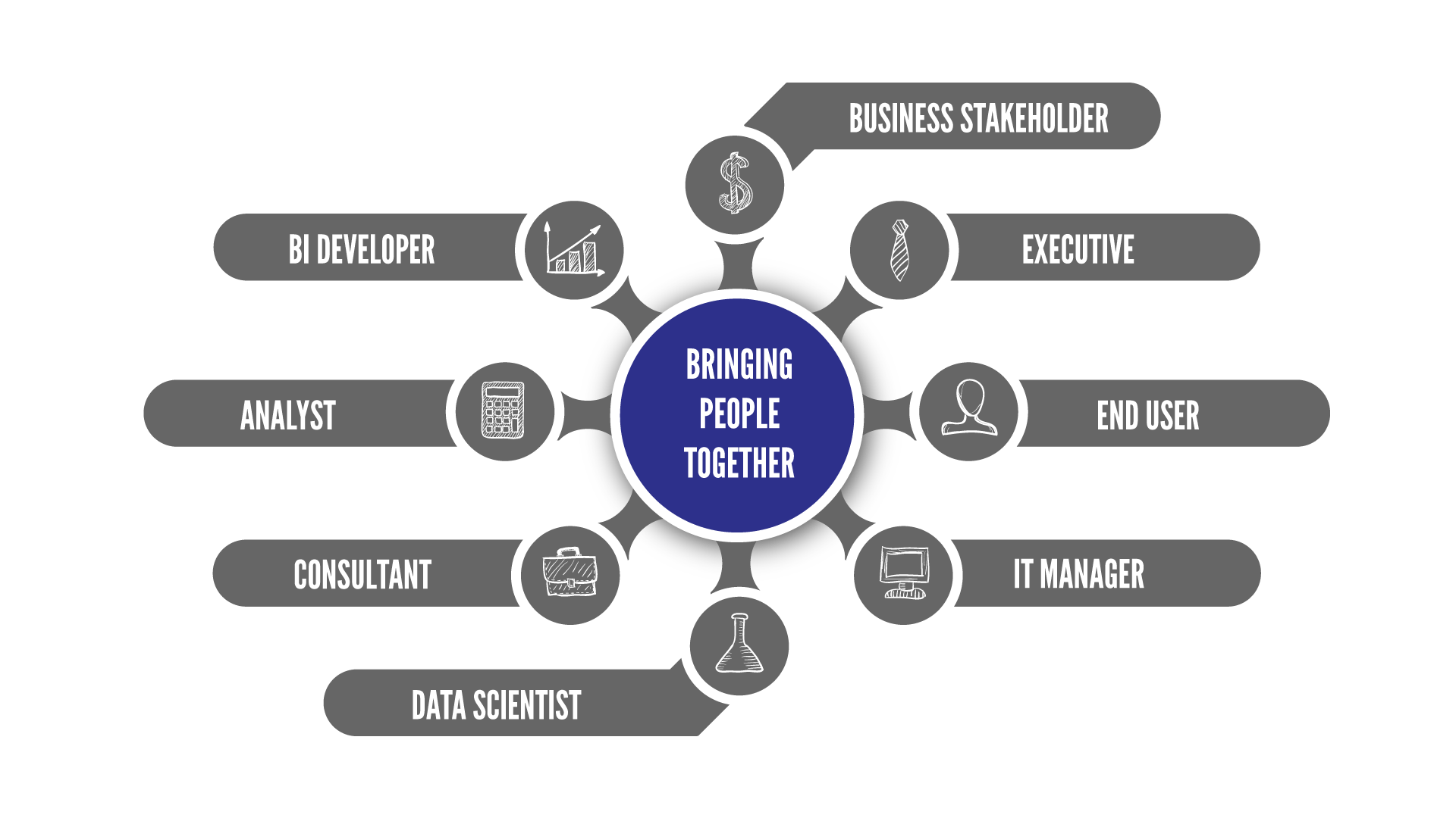
For a dashboard to serve the needs of your business and your end users, you’ll need to talk to anyone that can or will be involved. Try to get a balanced representation from each of the following groups:
| • Leadership and business owners | • Custodians of your data |
| • End users | • Dashboard developers |
Next, using the questions below as a guideline, interview your stakeholders. Their answers will help you clarify objectives, reduce risks, and gain valuable information about potential roadblocks in your analytics dashboard design:
• What is your role and what do you do day to day?
• What are your objectives and goals?
• How can this dashboard make your life easier?
• How do you currently access this data?
• What are your current challenges in accessing this data?
• What Key Performance Indicators (KPIs) do you currently use?
• What KPIs would you like to see?

2. Understand your data
Without a thorough understanding of your source material, you can’t get very far. In analytics, it’s important for you to understand your data, both at a high level and in detail. The more in-depth you get, the better, but even general information like what tables and columns are available is important. Understanding data quality is also recommended, but that can be tackled later if necessary. Regardless of what level you want to understand, you’ll need to speak with someone who works closely with the data and have them provide as much detail as possible. At the end of your conversation, you should:
- Understand what type(s) of data exist. Dashboards work with structured data—that is, data that is already organized into tables, columns, and rows—but it’s good to be aware of what else is out there that could inform decision-making.
- Collect the data. Get the database schema, as well as the schemas of any other data sources.
- Examine the data. Run through which columns have data of high enough quality for the first iteration of the dashboard. This is subjective, but the data should be robust enough to build confidence in anyone seeing it. A dashboard with incorrect or incomplete information isn’t very convincing.
- Improve the data as needed. Come up with a plan to improve any lower-quality data so it can be added to later iterations of the dashboard.
3. Wireframe the end vision
Gather your team
The next step in our analytics dashboard design process is to workshop your dashboard and begin the design process. To avoid having to redo any work or rehash any topics, it is critical to involve as many users and stakeholders as possible in this step. Together, you can agree on the overall purpose of the dashboard and brainstorm a comprehensive list of obstacles and risks.
Create personas and questions
The first phase of designing your dashboard revolves around personas, each of which represent a specific user group. You can leverage your work from Step 1 by merging some identities to create one to three primary personas. As you work, make note of what questions each persona might want answered, and note how thoroughly your current data is able to answer each question.
Translate the questions into visuals
Next comes the tricky process of visualizing each persona’s questions in chart form. Each chart should meet several criteria:
- What question does this chart answer?
- What action needs to be taken as a result of what we see on the chart?
- Is the data behind the chart sufficiently reliable?
Complete this process for all the questions your personas might have. With completed visuals in hand, you are ready to mock-up your dashboard.
Create a dashboard mockup
Before a developer can create a functional version of your dashboard, you’ll need to a provide a detailed mockup. Mocking up your dashboard is easiest using our Enterprise Dashboard Process kit. Whether you use that or choose to create by hand, you should focus on creating three types of panels: charts, filters, and KPIs. When put together, these become the content of your dashboard. Once your mockup is complete, you’re ready for the next step.
4. Build your dashboard and apply best practices
With your vision in hand, it’s time to work with a developer to create a live, functioning analytics dashboard. As you think about how to launch and share your dashboard, it may be helpful to look at the bullet points identified in Step 5. Choosing a platform that prioritizes usability and user requirements will save you time and money. Available options include Microsoft PowerBI, Tableau, Qlik, and more.
No matter which BI platform you use, modern business intelligence software is flexible enough to allow customization and accommodate best practices. Depending on how precisely you designed your wireframes in Step 3, some extra effort may be required to translate your vision into something your software can display. You and your dashboard developer should explore your dashboard design, customize it based on the tool’s capabilities, and establish best practices. Make sure to iron out any issues before moving on to Step 5.

5. Drive adoption to increase user engagement
Now that you have a functioning dashboard based on a well-planned vision, someone needs to be responsible for making sure users can find the dashboard, access it, understand it, use it, and extract value from it. Creating a plan for user adoption prepares you for deploying your dashboard and provides valuable user insights to improve future iterations.
What kind of knowledge management platform do people want to use? As it turns out, adoption is most successful for platforms that enable discovery, socialization, and gamification. People want easy access to a tool that is simple, useful, social, and fun. In practice, this equates to features like:
- Dashboard hosting
- Support for training materials
- Search
- Tagging
- Discussion
- Rating
- Sharing
The platform you use is just one of the many decisions you will need to make as you deploy your dashboard. It’s important to integrate change management and training as a part of your adoption process. Pay close attention to your users and their experience; no matter how reliable your data or flashy your interface, if people struggle to use your dashboard in their daily work, adoption will not succeed.
6. Repeat for the living dashboard
Your dashboard is live and providing value for people across your organization. Congratulations!
As time goes on, requirements for your dashboard may change. For this reason, it’s a good practice to release a new version of your dashboard every three months for the first year of its life. We don’t mean data refresh velocity; the data powering your dashboard should always be up to date. The structure of the dashboard, however, can be revisited every three months and adjusted as needed. After the first year, you can revisit your dashboard every six months. Our dashboard design process was created to work on both new and existing dashboards, so feel free to save this page as resource.
If you have questions on the dashboard design process or would like more information, please email solutions@logic2020.com.

