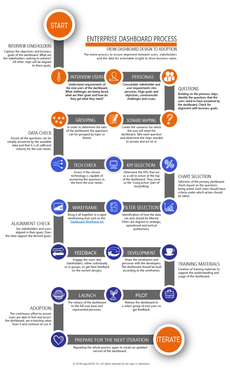
Business Intelligence Dashboards
DESIGN PROCESS
Dashboard design for insight and action.
Create analytics assets and dashboards that drive business value through behavioral change.
Creating dashboards that resonate with your users can be a challenge. Too often, teams create dashboards that create a negative user experience, lacks business value, and that does not have alignment between users and stakeholders. Wireframing dashboards is quickly becoming the optimal method to address these problems. The largest consulting firms in the world use these processes to make sure their dashboards will be valuable, actionable and insightful before development starts and on future iterations of their dashboards.
By taking a practical approach to enterprise dashboard design, you can ensure your dashboards bring value to your organization and deliver actionable insights for your users. Through a tried and tested process that consists of user/stakeholder interviews, workshops, and design and data visualization best practices, we can help you create a dashboard that meets your goals.
The Enterprise Dashboard Process addresses:
- Dashboard and data visualization best practices
- Reasons affecting poor dashboard design
- How to ensure a dashboard has business value
- How to define next steps and action items
- What an actionable dashboard looks like
- Real-world applications and examples
- Steps required to wireframe a successful dashboard
- How your data can tell a story

The Dashboard Wireframe Kit
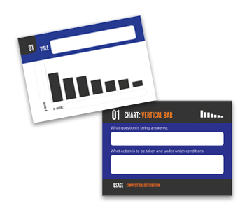
Our dashboard wireframe kit is designed to be used as part of the wireframe process. It comes with a board and decks of 54 cards for charts and graphs, with additional cards for filters and kpis. The board is clearly labeled with best practices to help you wireframe a dashboard that answers the key questions you have about your business.

Charts
Charts (and graphs and tables) are the graphic representations of data on your dashboard. They can be configured as bar charts, line charts, bubble charts, and more to compare any two characteristics of your data.

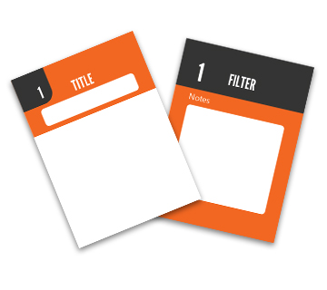
Filters
Filters enable you to drill down into your data and use questions to examine sub-sections of information. Most importantly, they control what content is displayed elsewhere on your dashboard.

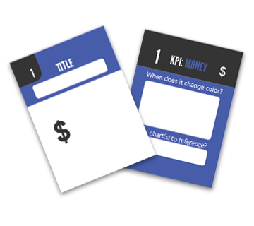
KPIs
Usually displayed as monetary values or percentages, Key Performance Indicators (KPIs) are predefined metrics that adjust in real-time, changing color to quickly display performance status. Instead of looking directly at facts and figures, these display the result of a formula or equation.
Dashboard Structure
Completed charts, KPIs, and filter cards can be organized on the Dashboard Wireframe Kit board. Using a dry erase marker, users can write directly on the cards and wipe clean later for reuse. Photos can also be shared with your development team.
The Enterprise Dashboard Design Process increases adoption and usability
Proven Formula
We’ve taken the guesswork out of how to lay out an enterprise dashboard. Our dashboard template is based on the solid foundation of hundreds of successful dashboards. Our template provides the canvas for you to tell stories with your data.
Business Value
Our dashboard design process is driven by your business questions. Instead of simply starting with an overwhelming amount of data, you can design a dashboard that is clear and relevant with true business value. Solving business problems and answering key questions are the highest priority.
Behavioral Change
Data doesn’t mean much if you don’t know what to do with it. In our process, charts and graphs are associated with specific actions, so users know how to respond: what, when, and how to take action. That’s real behavioral change.
Technology Agnostic
The most important part of your dashboard is the information it gives you – not the technology it’s run on. That’s why our process works with a variety of tools, including Tableau, Qlik and Power BI.
Need help telling a data story?
Our free webinar is an interactive, virtual workshop aimed at helping you improve your requirements gathering process.
You’ll learn:
- The reasons behind the poor adoption of your analytics assets
- The 7 steps of the requirements gathering process
- How to deliver actionable insights, not just data
- And more!
